The Hidden Meanings Behind London’s Tube Seat Patterns
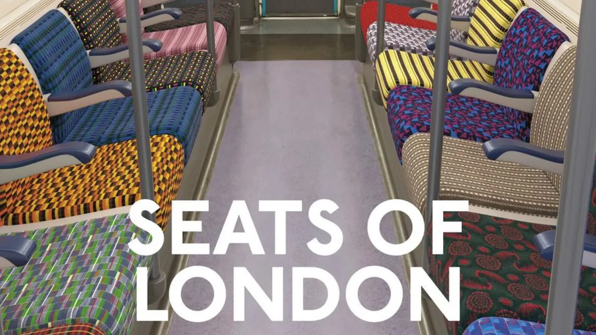
For millions of passengers travelling through the city each day, the patterns on London Underground seats are part of the background of daily life. They are familiar but rarely examined. Yet these distinctive fabrics, known as moquette, form one of the most recognisable design features of the transport network and carry decades of history within their woven patterns.
The tradition of patterned seat fabric has long been associated with the Underground’s identity. While many metro systems around the world favour plastic or metal seating, London’s use of moquette has helped create a warmer and more distinctive environment for passengers. Over time, the fabrics have become visual symbols of the network itself.
Behind each design lies a deliberate creative process that reflects the evolution of the Underground, the design philosophies guiding it and the changing character of the city.
The Design Legacy of London Transport
The origins of many Tube design traditions can be traced back to the influence of Frank Pick, the visionary transport leader who shaped the visual identity of the network in the early twentieth century. During his tenure with London Transport, Pick championed the idea that public transport should combine practicality with strong design principles.
His approach led to the creation of many of the visual elements still associated with the Underground today, including the roundel symbol, the Tube map and the distinctive architecture of many stations. Textile design was also part of this philosophy. Moquette fabrics were commissioned from leading designers to ensure that the interiors of trains reflected the same attention to aesthetics seen across the wider network.
Colour choices were often symbolic. Red was associated with the energy of the city, while green reflected the countryside surrounding it. These ideas helped shape the palette used across many early seat designs.
Barman: The Modern Icon
One of the most recognisable contemporary seat patterns is Barman, introduced across multiple lines in the early 2010s. Designed by the textile studio Wallace Sewell, the pattern stands out because it incorporates subtle references to London landmarks within its abstract forms.
Rather than presenting clear illustrations, the design blends shapes and structures into layered motifs that evoke familiar elements of the skyline. Depending on how closely passengers look, the pattern can suggest different buildings or architectural features, creating a slightly mysterious visual effect.
The design takes its name from Christian Barman, who worked alongside Frank Pick and contributed to the development of the network’s visual identity during the twentieth century.
Different lines use variations of the Barman pattern, often adjusting colour palettes to reflect the character of each route.
Line Identity Through Colour
The Underground network is well known for its colour-coded lines, and this system extends into the design of seat fabrics. On certain lines, moquette colours subtly echo the line colour used on the Tube map, reinforcing visual recognition.
On the Victoria line, for example, seat patterns incorporate repeating V-shaped forms arranged in bright white against darker backgrounds. The shapes create a sense of radiating movement while also referencing the line’s name and identity.
Other lines incorporate darker tones to match the atmosphere of older rolling stock or the historic character of particular routes.
New Designs for Modern Trains
As the network evolves, new trains introduce updated moquette designs that reflect contemporary design thinking. On the Elizabeth line, the seat fabric uses a more complex colour palette than most traditional Underground designs.
Multiple shades are woven together to represent the interconnected nature of London’s transport system. The pattern includes subtle references to the movement of trains across the network, creating a design language that reflects both technology and connectivity.
This layered approach demonstrates how moquette continues to evolve while remaining rooted in the Underground’s broader design heritage.
Functional Design Beneath the Pattern
While the patterns themselves attract attention, moquette is also chosen for practical reasons. The fabric’s woven pile structure makes it durable and resistant to heavy passenger use. Different finishing techniques, such as looped or cut fibres, influence how colours appear and how well the material withstands daily wear.
Seat fabrics near train doors often show the greatest wear because they are used most frequently, illustrating how design choices must balance aesthetics with durability.
A Cultural Symbol of London
Over time, Tube seat fabrics have become part of the visual language of London itself. Their patterns are now widely recognised by residents and visitors alike. The popularity of moquette-inspired merchandise, from cushions to bags sold at the London Transport Museum, demonstrates how deeply these designs resonate with the public.
For many passengers, particular patterns become associated with specific periods of their lives. A design seen daily during school years, university commutes or early careers can later evoke memories of those journeys through the city.
Design That Travels With the City
The story of London’s Tube seat patterns reflects a broader principle that has shaped the network for over a century. Good transport design is not only functional but also cultural.
Moquette fabrics may appear to be simple background details, yet they carry the influence of designers, transport leaders and the city itself. As trains continue to evolve and new lines open, future patterns will likely add their own chapters to this visual history.
For passengers riding the Underground each day, these patterns remain a quiet reminder that even the smallest design elements can help define the identity of a city.
Latest News
05 May 2026 · 2 minute read
by Arthur Bennett
Why London Underground Advertising is Effective for Reaching Daily Commuters

07 Jul 2025 · 4 minute read
by Penny Hargreaves
How London Underground Ads Shape Daily Habits and Influence Commuters

22 Apr 2025 · 4 minute read
by Penny Hargreaves
Piccadilly Circus: Where London’s Advertising Story Shines Brightest
Our Valuable Clients, Past and Present


Schedule a call
Pick a date and time for a call that suits you.
We can go through all the available format options and any other questions you have about successfully launching your next advertising campaign.
Launch Your Tube Campaign Today!
Get your brand in front of millions of Londoners and tourists as they move through the city. Just fill in your details on the form to advertise on the London Underground and our expert team will be in touch to kickstart your journey towards standout, high-impact results.
Join thousands of brands that stand out and connect with the transport network’s users.